Prompt3221 字符
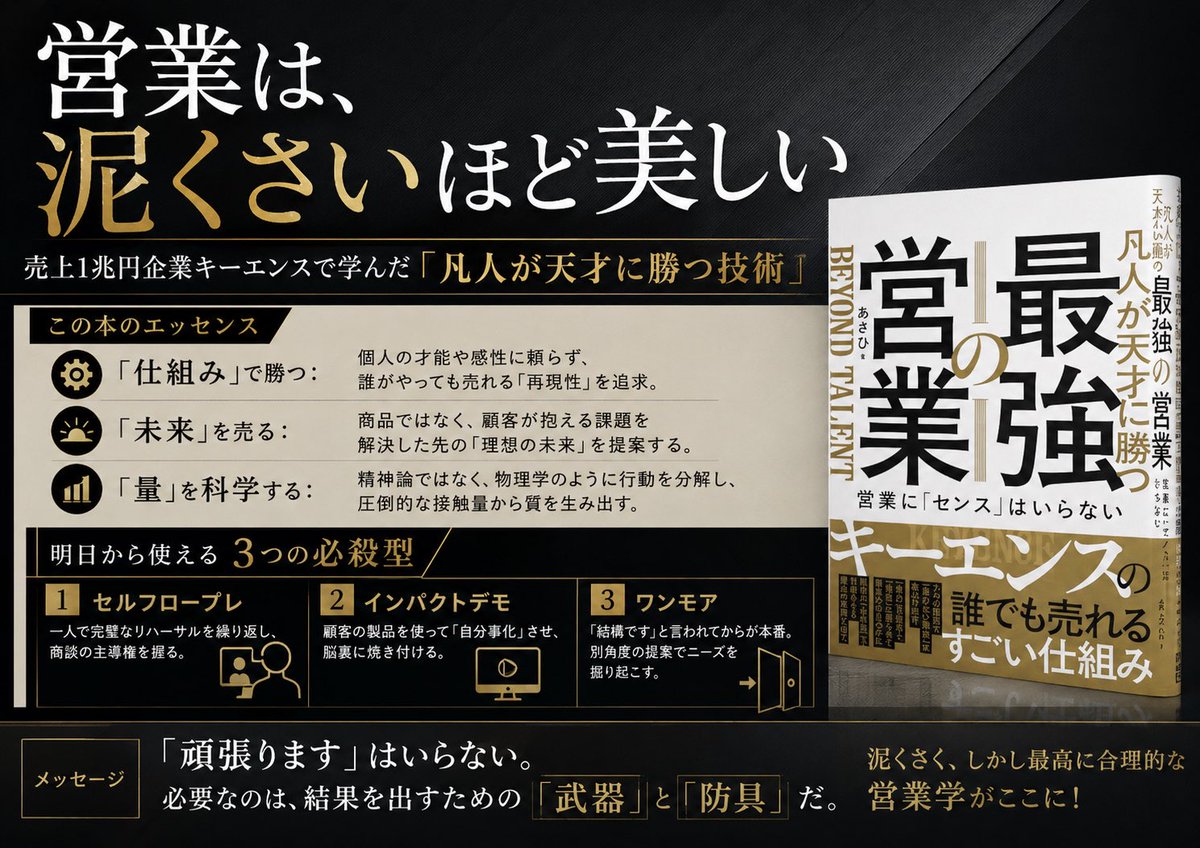
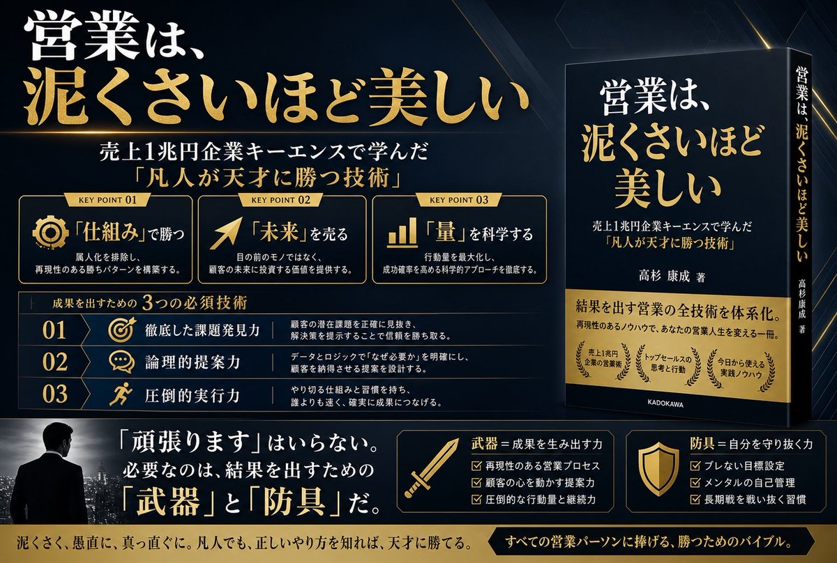
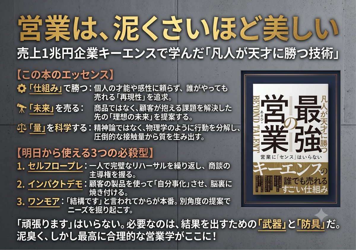
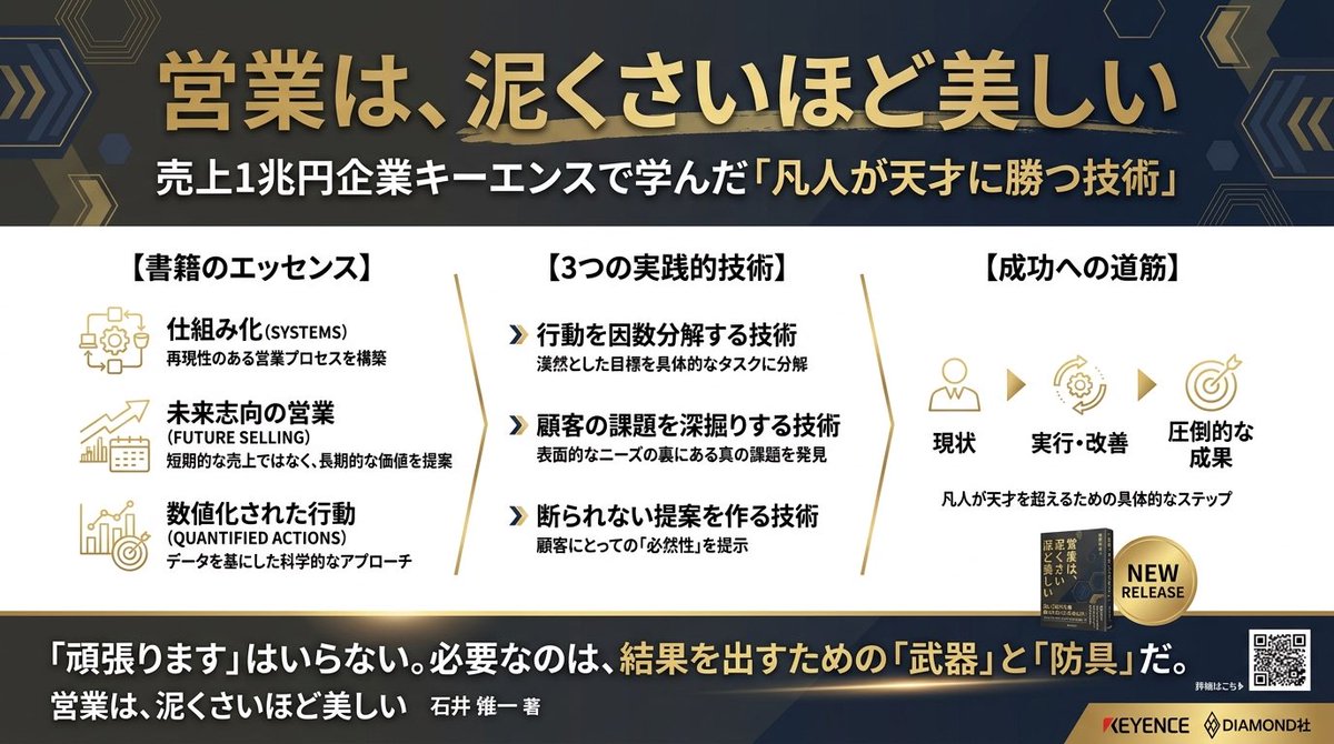
Goal: Create a premium Japanese business-book promotional infographic for {argument name="book title" default="最強の営業"}, presenting the idea that sales is more beautiful the muddier it gets, with a luxury black-and-gold editorial design.

Canvas: Wide 16:9 landscape advertisement, dark charcoal-black textured background with subtle diagonal fabric-like grain, sharp gold divider lines, high contrast white and metallic-gold typography. Overall feel: serious, authoritative, bestselling business book launch visual.

Layout: Left two-thirds is a structured infographic; right one-third shows exactly 1 upright 3D-rendered book mockup standing on a glossy dark surface with a faint reflection. The book cover is white, black, and gold, with oversized Japanese title text and a vertical spine visible. Add small supporting Japanese cover text, including the main title {argument name="book title" default="最強の営業"}, the phrase {argument name="sales phrase" default="営業に『センス』はいらない"}, and gold emphasis around the word キーエンス.

Top headline area: Large Japanese headline in the upper left: {argument name="headline text" default="営業は、泥くさいほど美しい"}. Make “泥くさい” metallic gold and the rest white. Beneath it, add a thin gold line and a smaller subtitle: {argument name="subtitle text" default="売上1兆円企業キーエンスで学んだ『凡人が天才に勝つ技術』"}.

Middle section: A cream-colored horizontal panel titled 「この本のエッセンス」 on a black-and-gold ribbon. Include exactly 3 essence rows, each with a circular black icon at left and Japanese label plus explanation at right: 1) gear icon, 「仕組み」で勝つ: explanation about not relying on individual talent or intuition and pursuing reproducible systems anyone can sell with; 2) sunrise icon, 「未来」を売る: explanation about proposing the customer’s ideal future beyond the product; 3) bar chart icon, 「量」を科学する: explanation about breaking down behavior like physics and producing quality from overwhelming contact volume.

Lower middle section: Black panel with gold borders titled 「明日から使える 3つの必殺型」. Include exactly 3 numbered method cards in a row: 1) 「セルフロープレ」 with a simple line icon of a person and speech bubble, describing repeating role-play alone before meeting clients; 2) 「インパクトデモ」 with a monitor/play icon, describing making the client experience convenience and internalize it; 3) 「ワンモア」 with an open-door arrow icon, describing making one more angle of proposal before giving up. Use gold numerals in small boxed labels.

Bottom message strip: Add a small outlined label 「メッセージ」 at bottom left. Main sentence in large Japanese text: {argument name="bottom message" default="『頑張ります』はいらない。必要なのは、結果を出すための『武器』と『防具』だ。"} Highlight 「武器」 and 「防具」 in gold outlined boxes. At bottom right add a gold closing line: 「泥くさく、しかし最高に合理的な営業学がここに!」

Visual style: Japanese corporate advertising, bookstore poster, elegant typography mixing Mincho-style serif Japanese and bold Gothic Japanese, crisp grid alignment, metallic gold accents, off-white panels, subtle shadows, clean vector icons, realistic book mockup lighting.

Constraints: Use exactly 1 book mockup, exactly 3 essence rows, and exactly 3 method cards. Keep all text legible, preserve the Japanese wording, avoid extra logos, avoid people, avoid clutter, no watermark.![一张[LOCATION]的建筑平面图,铺展开来](/cached-gh/jau123/tweets/2032193497898336334/0.jpg)