Prompt2977 字符
Goal: Create a screenshot-like collage showing a pile of unusable AI-generated fictional world map attempts on a pale gray workspace, as if viewed on an image-generation history board. The subject is not one map, but a messy contact sheet of many map thumbnails for a future fictional nation.

Canvas: Wide 16:10 landscape canvas, light gray background with a faint dotted grid pattern. Leave generous gutters between thumbnails. The entire composition should feel like a zoomed-out browser or design-board view, with some thumbnails cut off by the right edge.

Layout: Arrange exactly 35 visible map thumbnails in an irregular grid. Count them as: 8 small thumbnails across the top row, 10 large landscape thumbnails in the middle two rows, 12 smaller portrait/landscape thumbnails in the lower middle arranged in paired columns, and 5 large purple-themed thumbnails along the bottom row. Include several partially cropped thumbnails on the far right edge to imply the board continues off-screen.

Thumbnail content: Each thumbnail is a different failed variation of a futuristic world map for {argument name="fictional nation name" default="United Federation of Valoria"}. Most maps show altered Earth-like continents but not an accurate real-world map. Use dark navy or black ocean backgrounds, neon blue coastlines, cyan glowing borders, faint green landmasses, satellite-map textures, grid overlays, small HUD-like ticks, and occasional white title text. Some thumbnails should look like color tests: one bright blue-and-yellow terrain map, one simple black-outline map on white, and multiple glowing cyberpunk versions. The bottom row should use a different purple faction label, {argument name="bottom faction name" default="Empathia Union"}, with purple-highlighted landmasses around Eurasia/Australia-like shapes.

Visible labels: Repeat the title text on many thumbnails, usually centered or near the lower third, reading {argument name="main map label" default="United Federation of Valoria"}. Vary the typography and size slightly so some labels are tiny, misaligned, or awkwardly placed. Bottom-row thumbnails should instead read {argument name="purple map label" default="Empathia Union"}. A few labels may be partially illegible due to scale, cropping, or glow.

Visual style: Make it look like a collection of generated image results, not a polished infographic. Use inconsistent map compositions, inconsistent coastline shapes, different zoom levels, different title placements, and slightly mismatched aspect ratios. The dominant palette is black, deep navy, electric cyan, blue, green, and purple, with occasional white thumbnails and one or two bright terrain-map thumbnails.

Constraints: Do not create a single clean world map. Do not make the continents match the real Earth exactly. Do not add people, UI controls, large captions, watermarks, or a polished final design. Preserve the feeling of many discarded attempts scattered on a pale dotted canvas.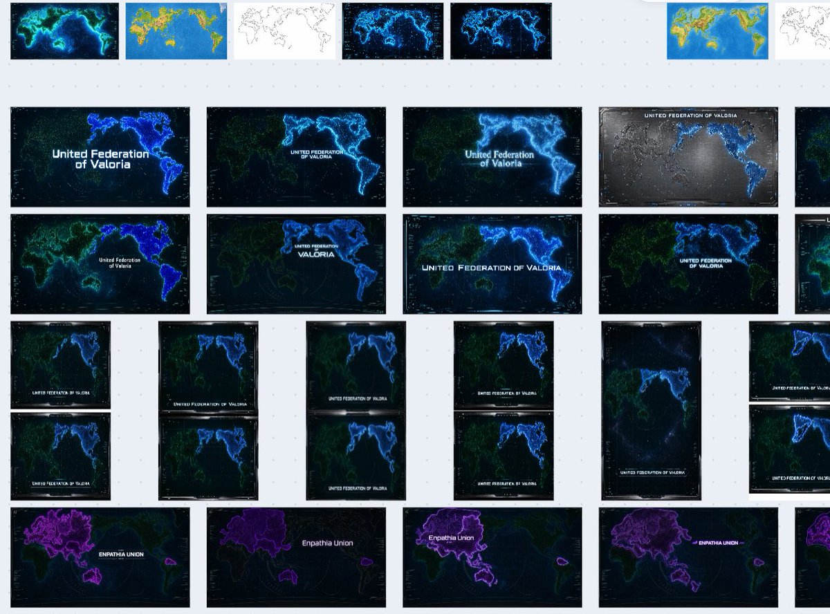
![一张[LOCATION]的建筑平面图,铺展开来](/cached-gh/jau123/tweets/2032193497898336334/0.jpg)