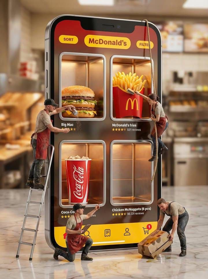
Prompt2805 字符
Generate a vertical printed poster around specific theme content. First, translate the theme into an enlarged tactile main specimen or mass of matter, placed in the center or lower-middle of the frame, giving it clear recognizable edges, soft volume, local high-density details, and touchable material changes. The subject is not displayed in isolation but is sandwiched by a giant title, edge text, hard-edged checkerboard modules, and low-contrast explanatory text. The title uses a heavy font with a clear skeleton, becoming an edge structure at the top, bottom, or side, participating in the composition like a wall, base, or sidebar; text forms the structure before carrying semantics. Let the subject's outline, attached fragments, material edges, or symbolic shards partially overlap titles, vertical text, and geometric blocks, forming a clear but restrained foreground-background layer, so that imagery and layout interweave rather than avoid each other. The background is a single warm, low-noise, printable paper field with fine grain, fibers, particles, and a slight ink-absorption feel, used to unify the realistic subject, flat text, and geometric blocks. The background maintains a sense of breathing and medium, without creating real space. Colors are layered by responsibility: the paper base takes up the largest area; the subject retains the most delicate emotional colors, soft gradients, and local saturation; titles, edge characters, or checkerboards use flatter, more stable structural colors; body text and annotations recede into the paper with low contrast. The overall balance features clear area differences, brightness order, and a sweetness suppressed by the structure. Place one or two hard-edged checkerboard modules in corners as planar rhythm anchors; they have no perspective or shadow, printed directly on the paper to balance the subject's curves, title volume, and white space pressure. Small body text should not look like independent labels but be compressed into compact informational textures embedded in the gaps around the subject, maintaining short line spacing, restrained colors, and an editorial feel. Details of the subject are concentrated only in positions that best convey tactile sensation and theme identity, while other secondary edges are allowed to be cropped, blocked, or slightly softened to maintain hierarchy. The final surface has a vintage print passivation, with slightly soft text edges, ink deposition in color blocks, and paper texture running through all layers without blurring subject details, overall presenting a hybrid of a carefully typographed editorial poster, packaging layout, and specimen description.

Theme: {argument name="poster theme" default="Apple promotion poster"}
Ratio: {argument name="aspect ratio" default="9:10"}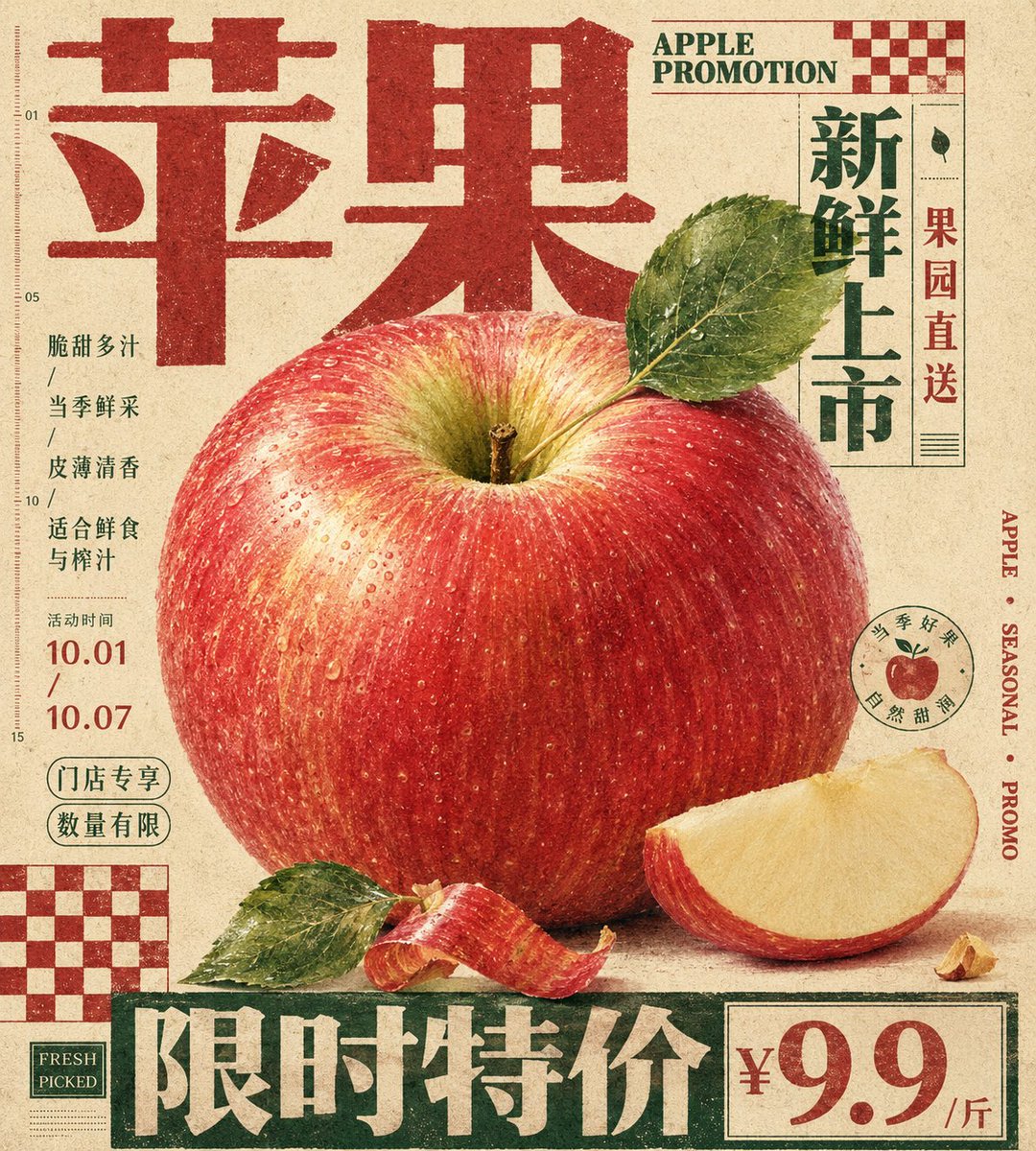


![[路易威登]](/cached-gh/jau123/tweets/2013325907843219831/0.jpg)
![[品牌名称] + [产品]](/cached-gh/jau123/tweets/2037967998565089736/0.jpg)